 Prestashop Themes and Module Blog PrestaShop News, Tutorials & Marketing Tips

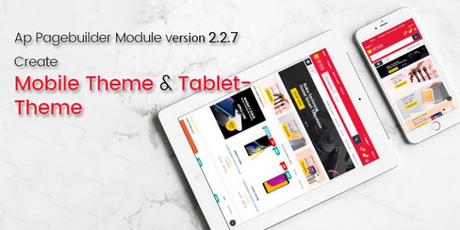
In the previous blog, we introduced you the newly updated features of the Ap Pagebuilder Module in version 2.2.7 namely
- Support mobile theme and tablet theme
- Apply lazy load for images of the whole website
- Allow put image link and image data
Read more New updates of Ap Pagebuilder Module version 2.2.7
These updated features play very important roles in enhancing user experience and your website’s speed. The first and foremost new feature of Ap PageBuilder Module version 2.2.7 – Support create mobile theme and tablet theme – is the ability to use a triple theme, one for computer, one for mobile and one for tablet. Many customers ask me questions like Is it possible to use a different theme that is only used for mobile or tablet? Or in any way that we can specify on which devices the theme will be active? Is it possible to hide some parts of the UI for mobiles, tablets but still display on the desktop? etc. Yes, now these problems have ways to solve them thanks to the feature mobile theme and tablet theme supported by Ap Page Builder Prestashop Module version 2.2.7.
This article will guide you on how to utilize this feature, to create a mobile theme on Prestashop and similarly, create a tablet theme on Prestashop.
How to create a mobile theme and tablet theme on Prestashop – Ap Pagebuilder Module?
After download and override the new version 2.2.7 of Ap Page Builder Module, to get this feature, you have to access the Back-office > Ap Pagebuilder > Ap Module Configuration then Click on Update and Correct Module In Profiles interface, you can select profiles for mobile and tablet as below.
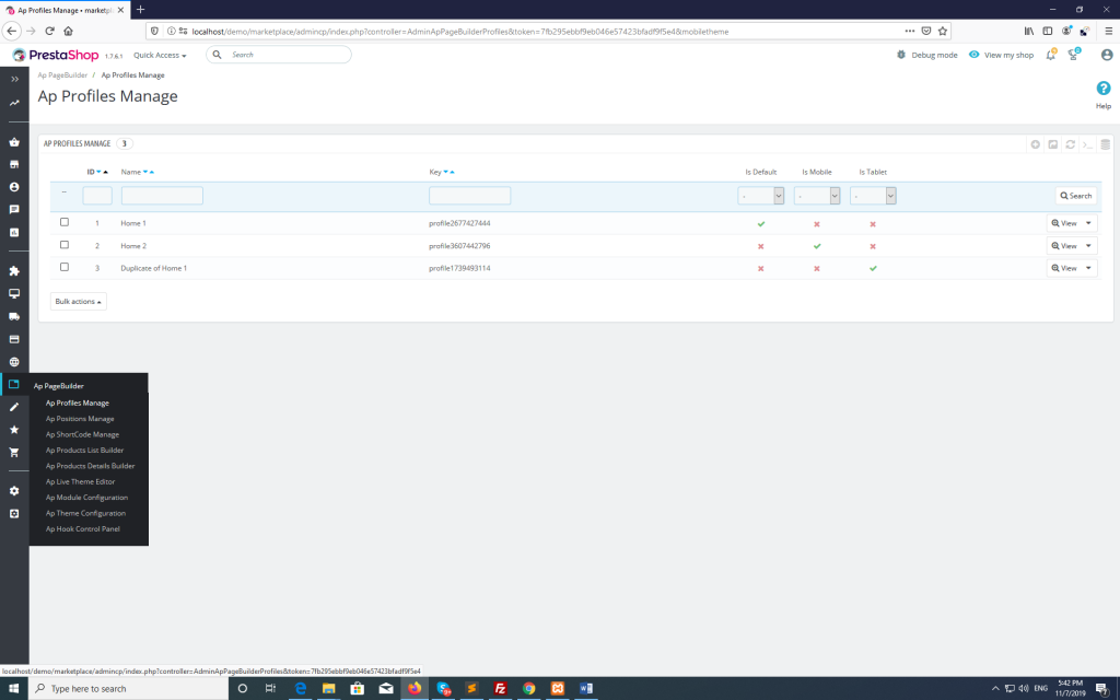
Tip: You can duplicate profile for desktop then change images, edit for mobile on the duplicated profile, you will have a good score on Google Speed.
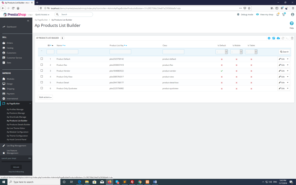
Similarly, you can select the default interface of the Product list and Product Detail page:

It is easy, isn’t it? Now you have your own interface for mobile and desktop
Besides, you can enable or disable for this feature
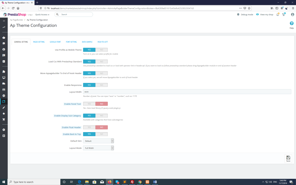
If you choose to disable this feature, that means you use a desktop theme for both mobile and tablet.
Everything is just so easy and simple to create a mobile theme and tablet theme on Prestashop with Ap Page Builder Module version 2.27 but the effect it brings is remarkable:
- use a triple theme, one for computer, one for mobile and one for tablet
- create and use a different theme on desktop, mobile, tablet
- ability to active themes on any devices
- hide or display some parts of the theme for different devices
Let share with us what you think and want to improve with our Ap Page Builder Module in the comment box below. Your contributions are appreciated.
Thank you
Related Topic:
- New Updates Ap Page Builder Module version 2.2.7
- How to use Image Hotspot Widget Prestashop
- Ap Page Builder: Install PrestaShop Page Builder – Leotheme Tutorial
- Ap Page Builder PrestaShop Module – The best Prestashop Module 1.7.6 For Builder Content
- Leo Parts Filter | Car Parts Filter PrestaShop Module 1.7.6
- Leo Blog PrestaShop 1.7.6 Module
- Amazing PrestaShop Project: Disable attribute out of stock with currently attribute in product Prestashop 1.7
- Plan to update Prestashop themes to version 1.7.6 | Leotheme
- [UPDATING] Best PrestaShop 1.7.6 Modules with New Enhancements
- PrestaShop 1.7: Add Payment Method PrestaShop 1.7 – Leotheme Blog